
No matter your industry or your product, your company likely has dozens of rivals (if not hundreds)—some of them direct competitors, some of them indirect competitors, and some of them aspirational competitors. One way to showcase how your product triumphs over its alternatives is by creating a competitive comparison landing page for your website. These pages are designed to publicly present an honest and comprehensive comparison between two or more competing products in a market.
These web pages help ensure both parties are a mutual fit and that there are no questions unanswered when retaining or going into a new partnership. Current customers will never wonder, “Is XYZ’s product really cheaper than ABC’s?” and prospects will never ask themselves, “Does XYZ offer the same benefits as ABC?” Both questions can be answered by exploring a competitive comparison page.
These pages are an opportunity to showcase your company’s strengths and perks in layman’s terms, setting your brand apart while helping to seal the deal for your sales team. Plus, it allows you to control the narrative by drawing conclusions and pulling out the data for them.
Now, let’s dive into some specifics so you know what steps to take when creating your new landing page.

Make your competitive comparison landing page stand out
When companies are looking for a new vendor or partner, their first stop is almost always a company’s website examining all offerings, benefits, use cases, etc. Now, imagine this scenario: A potential customer is exploring various vendors and their websites but struggling to pinpoint key differences and unsure which route to go. Sounds pretty realistic, right?
This is a perfect example of when a competitive comparison landing page can come into play to provide some clarity and direction. Now, let’s explore some tips on what to include so that it resonates and provides clear direction for your targeted customers.
1. Have a broad and focused approach
When creating your competitive comparison landing page, your first action will be pulling together your rivals’ information for the comparisons and drafting the copy to go along with it. While that sounds simple, it is critical to keep all components of your page relatively general.
There are two main groups that will likely find themselves on your competitive comparison page–product seekers new to the market and those familiar with your brand who are looking to switch to something better. How can you connect with both groups? Keep all messaging and categories broad and your language succinct.
For example, the comparison categories that you choose to highlight are critical. Depending on the business model, keep it to the basics such as price, plans, benefits, etc., and be sure not to give away any of your secrets that competitors can use to their advantage. In other words, be deliberate with your language and smart about what you’re sharing on the page.
Take this HubSpot competitive comparison landing page, for example. While HubSpot does use concise language, it is obvious that they are not afraid to further expand upon the benefits of their product. Be cognizant of not overpromising and all of the details being 100% factual!
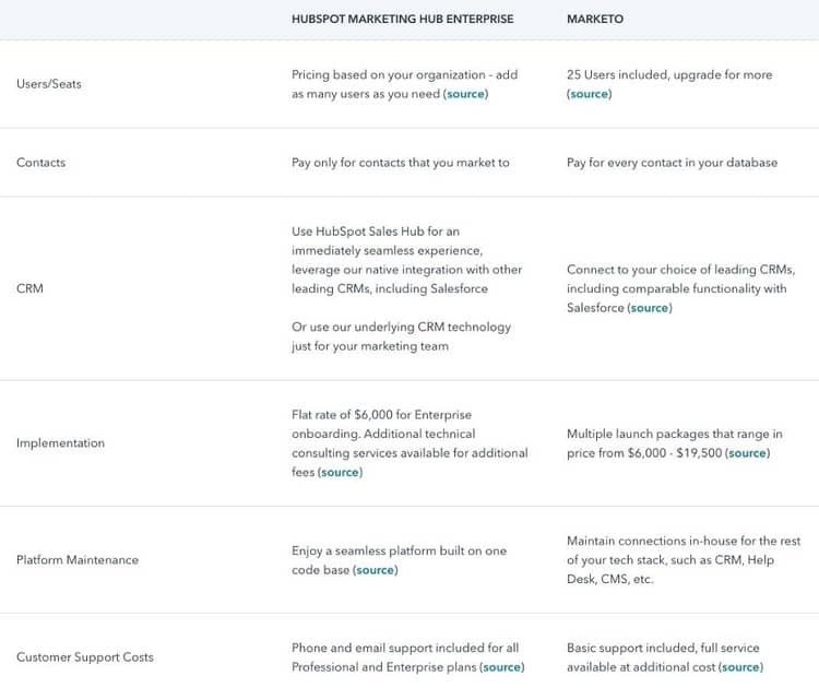
Also, when brainstorming the categories (like those above), don’t think about what your rivals do. Focus on what your company does and exceeds at, allowing you to put your company in the best light possible. Controlling the narrative means minimizing conversations where your company and product does not come out ahead. The whole point, after all, is for readers to walk away with a better understanding of how your product is superior in comparison to its alternatives. Make sure you don’t lose sight of that.
2. Be strategic when naming competitors
Make sure your page doesn't come across as overly-aggressive by focusing largely on the weaknesses of a certain competitor(s). This can leave a bad taste in the mouths of both potential (or current) customers and key industry players. There are two ways to approach this: (1) use a general comparison page that details your benefits over a competitive category or (2) include all major players in your industry. The latter is generally a more effective, detailed option.
Take a look at what Podia did, for instance.
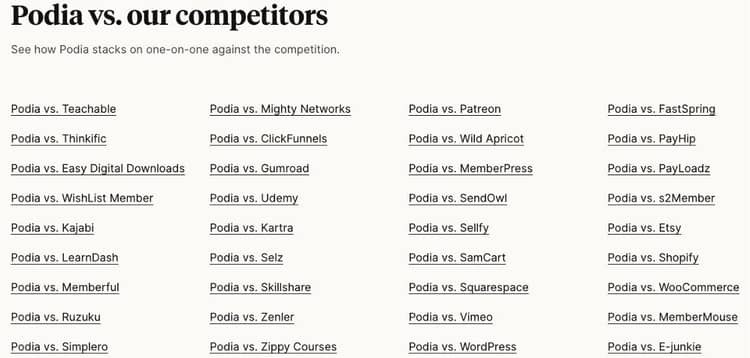
The company managed to include all competitors without the landing page getting too crowded. While these analyses were certainly time-consuming, the outcome is comprehensive, fair, and factual–and simply an impressive resource to have on hand!
Taking it a step further, once you click on a specific competitor, Podia directs you to a comparison list that has the same comparative categories set for each and every rival. Take a look at the Podia vs. Teachable comparison for reference.
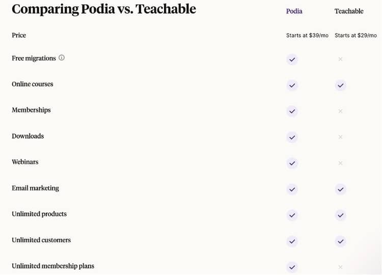
This comparison table is no doubt a great resource for anyone that is up in the air about a vendor or partner, and the categories are broad and strategic. And after all, prospective fits must be mutual. This is a way to ensure that no time is wasted, unfit prospects are weeded out, and that priorities between parties are aligned.
3. Be mindful of branding
A key consideration to note is that including a comprehensive competitor list (like Podia’s) could bring attention to a brand that a prospect hadn’t otherwise considered. To address this concern, leave out all competitors’ logos and branding. There’s also no need to link to their website, discuss their company mission, dive into their brand promise, etc. Keep it minimalistic and to the point about service offerings when referencing your competitors.
A great way to highlight your company without appearing overly brand promotional and biased is through strategic color placement. Skipping back up to Podia’s comparison table, take note of their subtle branding touches. For example, the Podia name is highlighted in purple–a way to emphasize and make them stand out while showcasing their brand color.
Check out this example from Vend, as well.
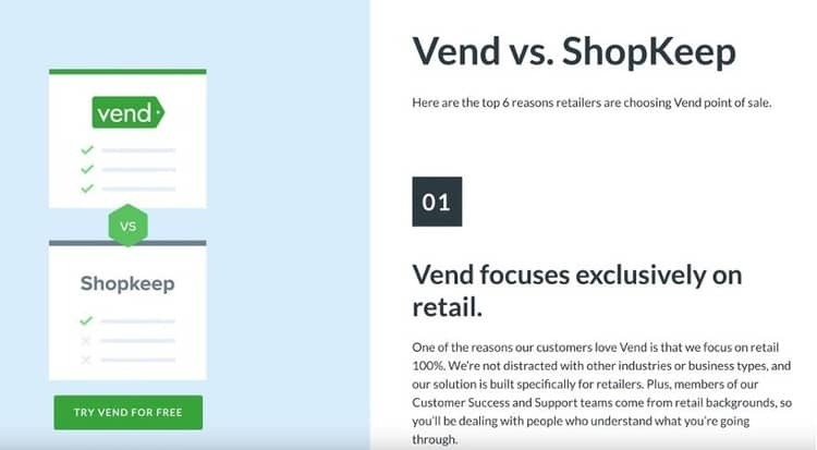
Even though the layout of this competitive comparison page is much different, the use of color is similar. Your eye immediately goes to the “Vend” name over “Shopkeep” and looks like the better option of the two. And to no surprise, green is Vend’s brand color as well. Although it may seem minute, strategic additions like color can make a big difference on your page.
4. Spotlight your current customers
Something often overlooked when creating competitive comparison pages is getting current customers involved. Open up a dialogue with your clients to see if they’ve worked with a rival of yours in the past and how they feel about your product thus far. Not only could this competitive intel be useful information for a variety of functions at your company including marketing, product, sales, etc., but you can add your customers' positive commentary to your new landing page (with their approval, of course).
Just like a testimonial section, add in quotes from your customers sharing why they believe your service is superior and how it helped them. This will provide a new level of trust and credibility to your brand name. In other words, let your customers speak for you!
Explore this example from Basecamp that highlights why companies made the switch over to their brand.
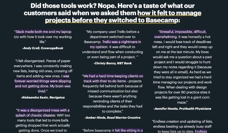
This example highlights customer experiences with rivals, hitting on pain points and negative experiences. Chances are, your readers have experienced similar situations and it can lead a prospect down the right path to you. And at the end of the day, companies can express that their product is superior but that doesn’t mean that prospective customers will actually believe it–until they see real-life recommendations and use cases from customers just like them.
5. Use SEO to your advantage
Lastly, one of the biggest benefits of creating a competitive comparison landing page is the search engine optimization (SEO) potential. For those unfamiliar, think of SEO as a digital marketing strategy that focuses on your website's presence in search results on search engines like Google or Bing.
Be strategic about the keywords you’re using on your landing page and ask yourself, “What would someone be googling right now if they wanted to compare us with XYZ?” Those Google search predictions can help you craft the perfect language to use on your landing page to rank high on search pages in comparison to your rivals.
Here’s an example for you from Sendinblue.
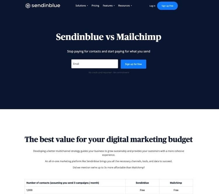
Imagine a ready-to-buy prospect types into Google “Sendinblue vs. Mailchimp” right before they make their final decision on a vendor. Guess what the first organic search result is on Google? You named it–Sendinblue’s competitive comparison landing page!
While you may not think anything of the title at a glance, it can hold immense value in bringing potential customers to your page and improving your overall website visibility. With this level of narrative control, it’s a step in the right direction to making that sale.
Approach your competitive comparison page the right way
As you begin to outline and create your competitive comparison landing page, remember to be strategic with your approach and all of the content, components, and companies you choose to include. Don’t lose grip of why you’re doing it–to position your company in the best light possible while providing readers with a fair and comprehensive comparison of your product’s alternatives.
To get potential customers in the door, there is no doubt that you need to display how your company is better than the rest. Creating a competitive comparison landing page is truly one of the most efficient (and easily accessible) ways to do this. While it may feel like another thing on your never-ending to-do list, the results will be worth it–and hopefully, your bottom line will grow in the process!


Seeing is believing! Check out Crayon for yourself.

Related Blog Posts


Popular Posts
-
 Sales Battlecards 101: How to Help Your Sellers Leave the Competition In the Dust
-
 How to Create a Competitive Matrix (Step-by-Step Guide With Examples + Free Templates)
-
 The 8 Free Market Research Tools and Resources You Need to Know
-
 6 Competitive Advantage Examples From the Real World
-
 6 Exceptional Brand Messaging Examples We Can All Learn From