More than two-thirds of competitive intelligence professionals say their in-house team is responsible for win/loss analysis.
Translation: A lot of folks—perhaps yourself included—are tasked with examining won and lost deals on top of monitoring competitors, creating feature comparisons, building battlecards, etc.
That’s a lot of ground to cover between the hours of 9am and 5pm—which is why simple win/loss analysis templates can be tremendously helpful.
This blog post is a step-by-step guide to creating three such templates in Microsoft Excel. Specifically, we’re going to show you how to create:
- A template for collecting and organizing basic win/loss data
- A template for segmenting lost deal rationale
- A template for segmenting competitive win rates
Let’s get started.
Win/loss analysis template: Data collection & organization
This first template is designed to help you collect and organize responses from your win/loss interviewees. It’s split into two sections: lost deals and won deals. We’ll kick things off with the former section.
To begin, use Column A to list the questions you’re asking buyers, and use Row 2 to list the names of the buyers.

Two quick things to note here:
- For the sake of simplicity, we’re using a small sample size of six buyers.
- Some of the questions we’ve listed may be inapplicable to your company. The first two, however, are essential, and the rest should be applicable to many B2B organizations.
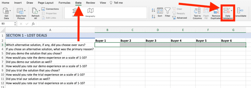
Next, highlight each of the blank cells in Row 3. Select the Data tab from the top navigation bar, and then click Data Validation.
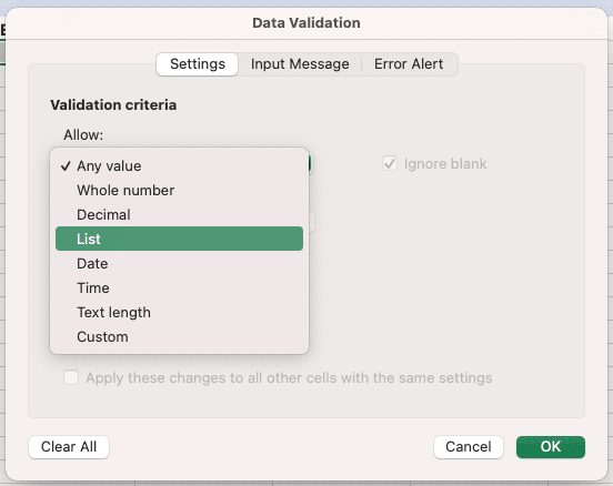
You’ll be prompted with a pop-up window. Open up the drop-down menu and select List.
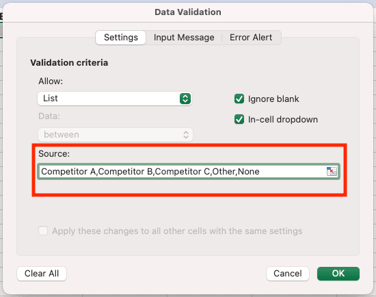
What you’re doing is constraining those cells in Row 3 such that the only allowable values will come from a list of your creation; in this case, the list will consist of your competitors’ names, an option for Other, and an option for None. Enter each of these values into the area labeled Source and separate them with commas.
Now, when you select a cell in Row 3 and click on the drop-down arrow, you should see the list of allowable values.

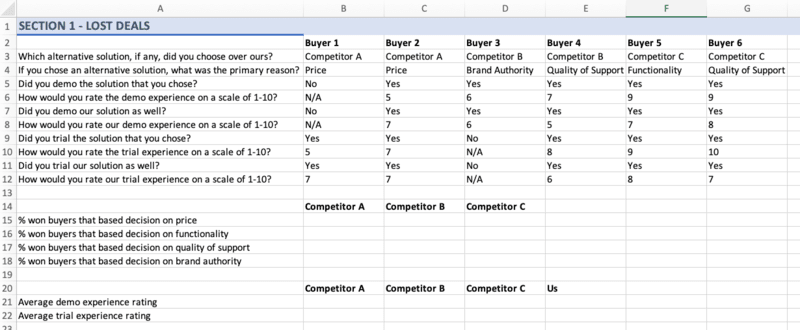
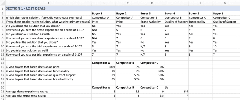
Repeat these steps for each question in Column A. Once this is done, you can fill in each cell given the responses of your interviewees, and you should be left with something like this:

Great! Now, let’s pull some meaning out of this raw data. Specifically, let’s go competitor by competitor and find out:
- Why buyers tend to purchase their respective solutions,
- What buyers tend to think of their respective demo experiences, and
- What buyers tend to think of their respective trial experiences.
Scroll down to a fresh row in your spreadsheet—in our case, we’re using Row 14—and list the names of your competitors. In Column A, specify each of the reasons why buyers tend to purchase solutions other than your company’s: price, functionality, quality of support, brand authority, and so on.
Scroll down a bit more—in our case, we’re using Row 20—and list the names of your competitors as well as your own company. In Column A, write “Average demo experience rating” and “Average trial experience rating.”
All we need to do in order to fill in each of these cells is use some simple Excel formulas. To calculate the percentage of Competitor A’s won buyers—i.e., the buyers who have forgone your company’s solution and opted for theirs—who based their decision on price, simply divide the number of buyers who went with Competitor A for pricing reasons by the total number of buyers who went with Competitor A. Do the same for each of the reasons you’ve listed in Column A, and then repeat the process for the rest of your competitors.
With that taken care of, use the AVERAGE function in Excel to calculate each company’s average demo experience rating and average trial experience rating—and make sure to include your own company! At this point, your spreadsheet should look something like this:
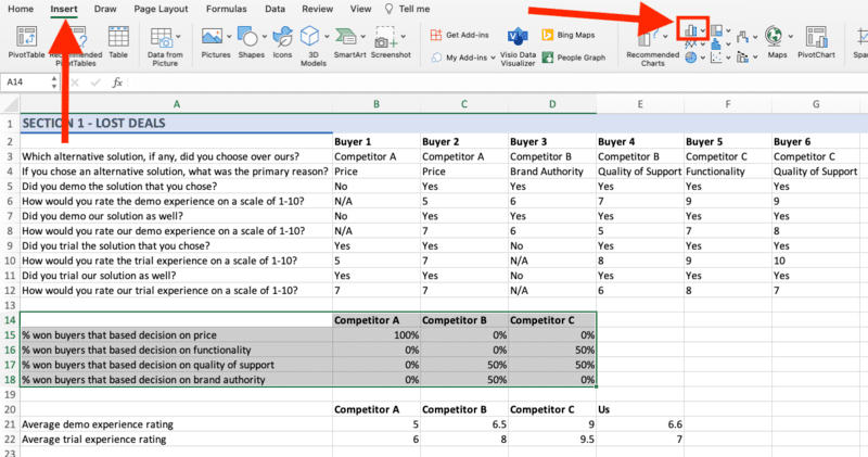
This is all well and good, but you’re going to need some visualizations. Highlight that first table of data, select Insert from the top navigation bar, and click on the small Charts icon.
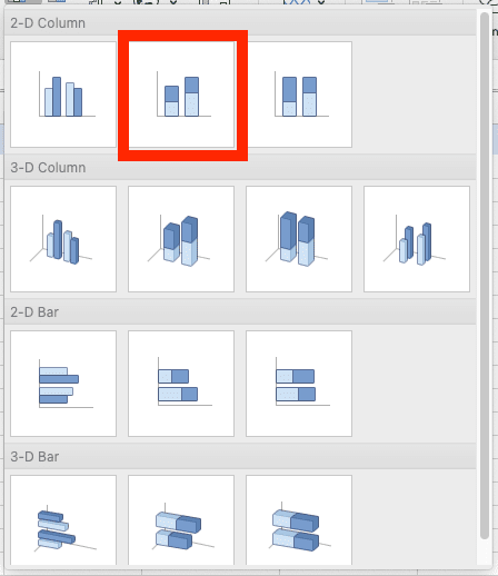
Select the Stacked Column option.
Once the initial iteration of your chart is generated, select Chart Design from the top navigation bar and then click Switch Row/Column. This will make your chart much easier to interpret.

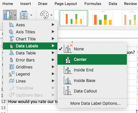
Sticking with the Chart Design tab, head to the left-hand side and click Add Chart Element.

From the drop-down menu, select Data Labels and then Center.
Give your chart a title, and boom—you should have a simple yet meaningful visualization that looks something like this:
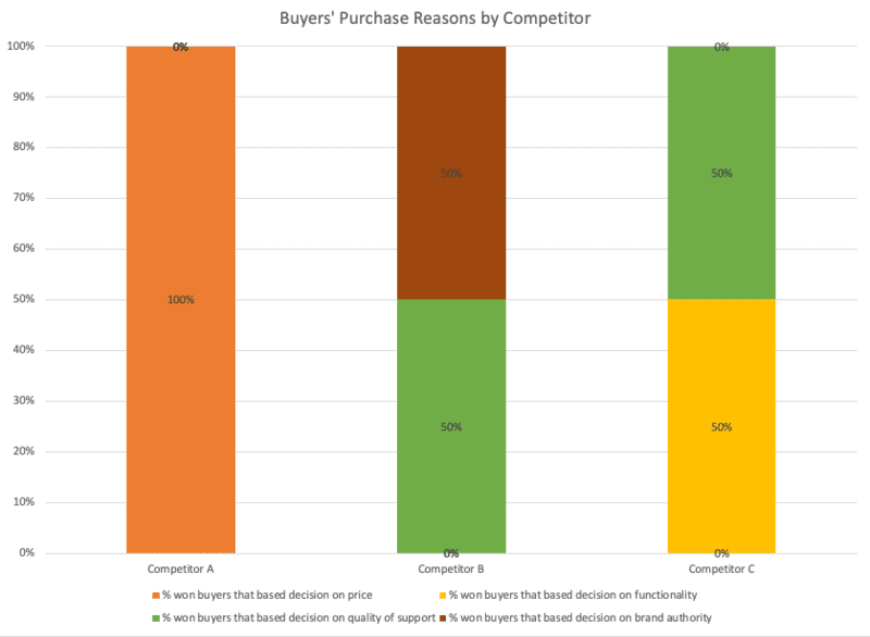
Using our chart as an example, what can we conclude? Well, for one thing, when Competitor A beats us, it’s because their solution is cheaper than ours. Competitor B, on the other hand, has positioned itself as an authority on the matters that our prospects care about, and Competitor C is clearly making a sizable investment from a product and engineering perspective.
(Again, our hypothetical sample of buyers is obviously very small, but the spirit of what we’re doing is legitimate: You can use our template to draw conclusions regarding your industry rivals’ competitive advantages.)
But we’re not done with this template yet! Repeat the above steps to create a chart for your second table of data—the table with each company’s average demo and trial rating—except, this time, select Clustered Column.
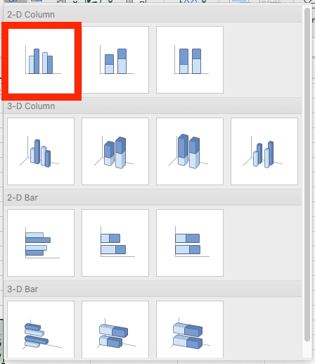
Follow the same steps as above to add data labels and a title, and you should wind up with a sharp visualization like this one:
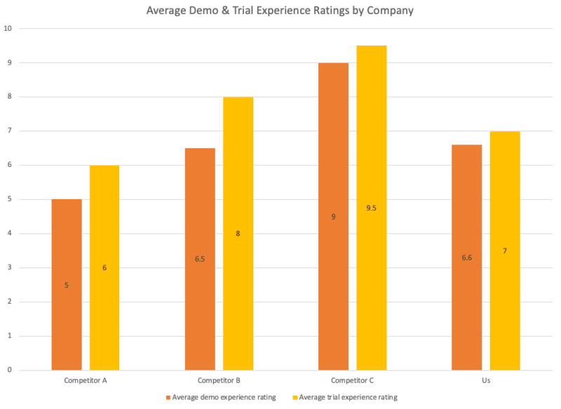
Again, let’s consider what we can conclude from this. Most importantly, it’s clear that we have some work to do in terms of how we demonstrate our product and how we enable our prospects to test-drive our product. Perhaps we should conduct a follow-up survey to pin down what, exactly, is missing from our demo and trial experiences. Secondarily, this chart further drives home the point that Competitor A’s only real competitive advantage is their pricing.
To wrap up our walkthrough of this first win/loss template, let’s fly through Section 2—the section dedicated to won deals. Once again, you’ll begin by listing your buyers’ names and your questions. Since you’re now dealing with buyers who have chosen your company’s solution, your list of questions should look slightly different.

Follow the same steps as above to set up your lists of response options. This time around, rather than calculating the percentage of each competitor’s won buyers who based their decisions on price/functionality/etc., you’ll be calculating the percentage of each competitor’s lost buyers.
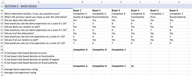
Repeat the steps from above to create your charts.
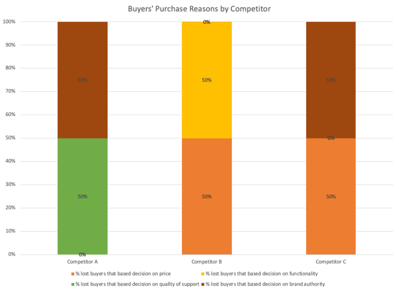
This chart isn’t quite as cut and dry as it’s equal in the lost deals section, but we can certainly still pull meaning out of it. For one thing, this reinforces the fact that price is not a source of advantage for us when we go head-to-head with Competitor A. But when we go head-to-head with either Competitor B or Competitor C, it’s a different story; clearly, some buyers see our pricing as more favorable than theirs. It’s also worth noting that buyers tend to perceive our brand as more authoritative than those of Competitor A and Competitor C—an advantage that we can lean into as we try to close the gap with Competitor B.
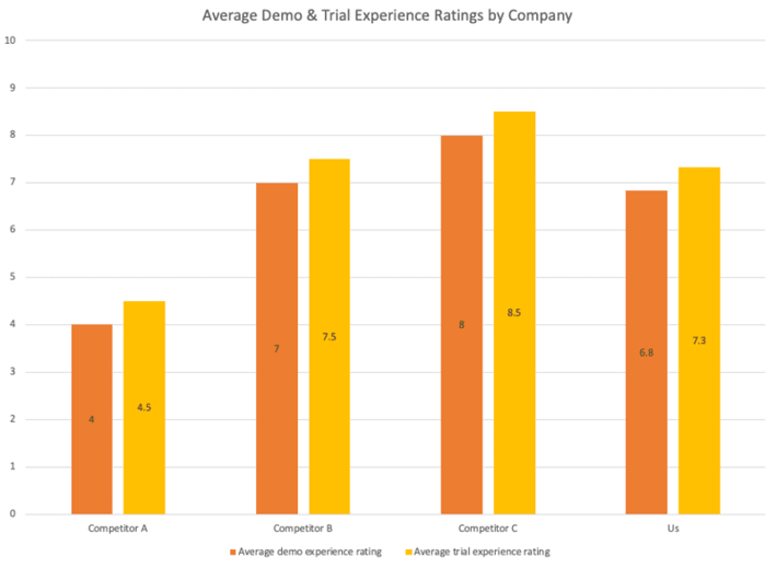
Unsurprisingly, amongst buyers that choose our solution, our demo and trial experiences are seen a bit more favorably relative to the rest of the field—but we clearly still have work to do there. This chart also reinforces the fact that price and brand authority are important sources of advantage for us, as we’re winning business from prospects who perceive Competitors B and C as more functionally impressive.
Win/loss analysis template: Lost deal rationale segmentation
One of the questions at the heart of win/loss analysis is Why do we lose to our competitors?
For any given deal, the answer to this question—especially for those of you at enterprise companies—can depend on several variables. It can depend on the size of the business your sales team was pitching. It can depend on the industry of the business your sales team was pitching. It can depend on the buyer persona your sales team was pitching. The list goes on.
In other words, the answer to Why do we lose to our competitors when we’re pitching small businesses? may differ dramatically from the answer to Why do we lose to our competitors when we’re pitching mid-sized businesses? The answer to Why do we lose to our competitors when we’re pitching biotech companies? may differ dramatically from the answer to Why do we lose to our competitors when we’re pitching real estate companies?
Since the primary reason your company loses a deal is more or less likely to be X or Y or Z depending on variables like these, it’s worthwhile to segment your lost deal rationale. And that’s what we’re going to do with our second template.
As an example, let’s segment by business size. In Column A, list the common reasons why your company loses deals. Across Row 1, list the different sizes of businesses to which your company sells. (Don’t worry if your company only sells to one segment of business sizes; as we’ll discuss, this template can be applied in many ways.)

Next, go column by column and fill in each cell with the corresponding percentage. If 20% of your company’s losses amongst small businesses are primarily due to Reason A, put 20% in cell B2. If 40% of losses amongst small businesses are primarily due to Reason B, put 40% in cell B3. Eventually, your spreadsheet should look something like this:

Now, highlight each cell and navigate to the Insert tab. Click on the Charts icon and select the Stacked Column option.

Follow the same steps as above to add data labels, and just like that—you’ve got a color-coded illustration of why your company tends to lose deals amongst different business size segments.

Right off the bat, we can see that we often lose deals involving large enterprises because of Reason C—let’s say that reason is functionality. Clearly, we need to improve our product in order to better address the needs of big-ticket clients. In the meantime, we may focus on arming our sales reps with the best possible talking points in order to highlight the functional weaknesses of our competitors’ products.
As we alluded to earlier, you can use this template to segment lost deal rationale by many different variables. Take industry, for example:
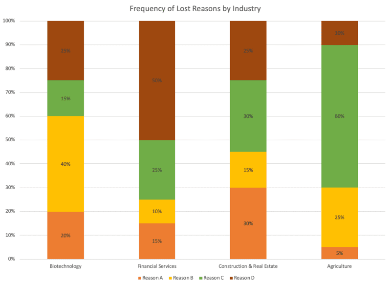
And here’s the same template segmented by buyer persona:
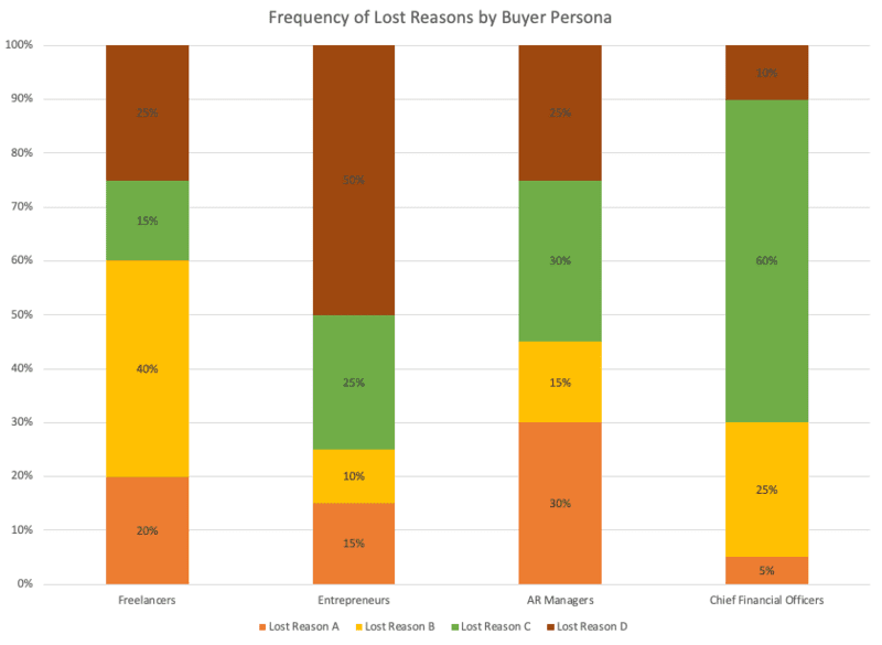
Use this template to get granular with your analysis of lost deals. The more you know about the factors that influence your sales team’s performance, the better equipped you are to enable improved performance.
Win/loss analysis template: Competitive win rate segmentation
Another question at the heart of win/loss analysis is How often do we win against each specific competitor?
Again, for any given competitor, the answer to this question can depend on several variables. It can depend on the time of year. As with our previous question, it can depend on the industry. And for those of you with large sales teams, it can depend on which specific unit of your sales team you’re evaluating.
The answer to How often do we beat Competitor A in Q1? may differ from the answer to How often do we beat Competitor A in Q2? The answer to How often does Sales Team 1 beat Competitor A? may differ from the answer to How often does Sales Team 2 beat Competitor A?
Since the rate at which your company wins against a given competitor can change with variables like these, it’s worthwhile to segment your competitive win rates. And that’s what we’re going to do with our third and final template.
As an example, let’s segment by quarter. In Column A, list each quarter of the year. Across Row 1, list each of your competitors.

Next, go column by column and fill in each cell with the corresponding win rate. If your company’s average win rate against Competitor A in Q1 is 40%, put 40% in cell B2. If your company’s average win rate against Competitor A in Q2 is 35%, put 35% in cell B3. Eventually, you should have something like this:

Now, highlight each cell and navigate to the Insert tab. Click on the Charts icon and select the Clustered Column option.

Follow the same steps as above to add data labels, and there you have it—a color-coded illustration of how often your company beats each competitor over the course of a year:
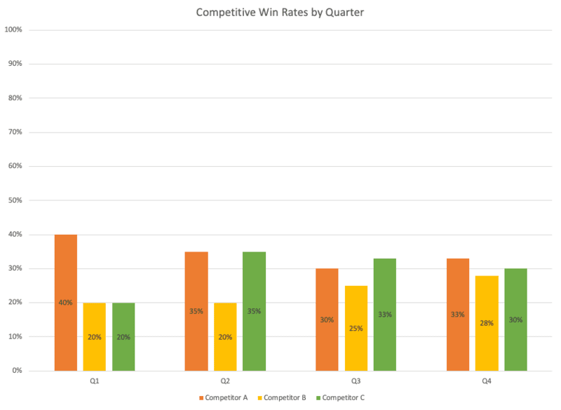
Straight away, we can see that—with the exception of deals involving Competitor A—our sales team typically gets off to a slow start at the beginning of the year. This is worth investigating, as you may be able to make adjustments that drive up those Q1 win rates and create tons of momentum for the rest of the year.
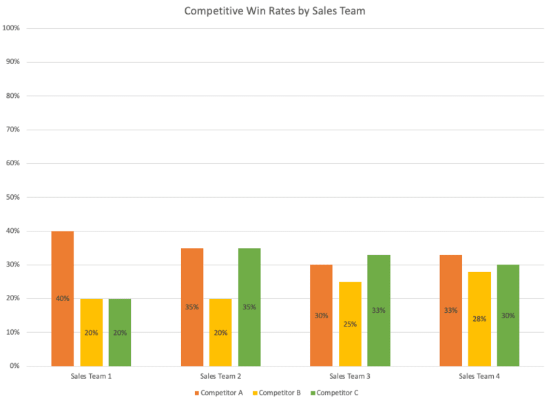
Other applications of this template include segmenting by sales team unit …
… and segmenting by industry:
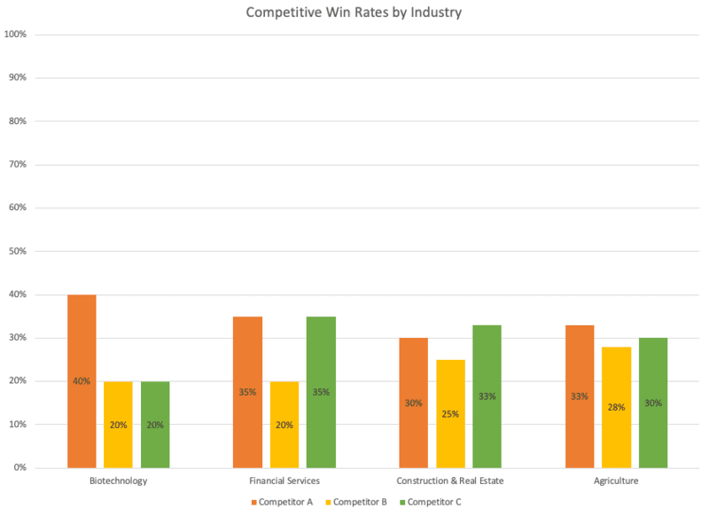
Again, granularity is your friend here. Your sales enablement team can’t be everywhere at once, so it’s best to establish data-backed priorities and focus your efforts accordingly.
Get insights quickly with our free win/loss analysis templates
As we discussed in the introduction to this post, many practitioners of win/loss analysis are doubling as practitioners of competitive intelligence. And although creating templates in Excel is relatively straightforward, it does take time—time that you probably don’t have.
To cut down on manual effort and get your insights faster, check out Crayon’s free win/loss analysis templates. Whether you want to streamline the collection and organization of data, segment your lost deal rationale by industry, or get granular with your competitive win rates, you can get it done with our templates. Get yours today!

Related Blog Posts
Popular Posts
-
 Sales Battlecards 101: How to Help Your Sellers Leave the Competition In the Dust
-
 How to Create a Competitive Matrix (Step-by-Step Guide With Examples + Free Templates)
-
 The 8 Free Market Research Tools and Resources You Need to Know
-
 6 Competitive Advantage Examples From the Real World
-
 6 Exceptional Brand Messaging Examples We Can All Learn From


