If you’re looking for new ways to differentiate yourself from your competition, redesigning your website is a solid place to start. When people hear about your brand, they will likely head to your website or even your social media profiles - which will then likely direct them to your site. When they get to your site, you want them to see what you have to offer, front and center. You know that when you offer a product or solution, there are more likely than not, other companies that have similar offerings. When people come to your website, you want them to think of your brand as the best in the industry and choose your offerings over those of your competition.
Designing a website in a competitive industry is a loaded task. You want to make sure you stand out from your competitors when it comes to color, design, imagery, messaging, and CTAs. You also want to ensure that you are meeting the needs of your target customers by highlighting how your solution solves their problems. With so many moving parts going into a differentiated website, let’s take a look at five pairs of rivals to see how they differentiate themselves from their competition through their websites.
Head to Head: Marketing Automation Software
As far as marketing automation goes, HubSpot and Marketo are among some of the top choices. While both platforms offer lead management, marketing automation, and benefits for both sales and marketing teams, their websites tell different stories.
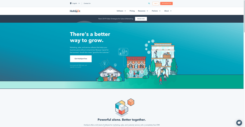
HubSpot uses its homepage to highlight a free trial, featured front and center. Their navigation shows off their capabilities, showing that they have special software for sales, marketing, and services. As well, they highlight their resources and partners in the homepage navigation. As you scroll down, you can see highlights of each “hub,” as well as many social stats.
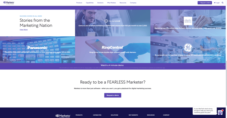
Marketo takes a different approach to their homepage. Rather than having one key call-to-action at the top, they have a slider showing off different elements of their software, different offers to “learn more,” and highlighting their upcoming events. Marketo highlights not only their top customers but shares case studies from many of them, right on the homepage.
One key difference in HubSpot’s site versus Marketo’s is that HubSpot uses illustrated graphics, whereas Marketo uses photos of real people. As well, HubSpot is very colorful, whereas Marketo is clean and within one color palette. The messaging on Marketo’s homepage packs more a punch than the messaging on HubSpot’s page, too. However, through HubSpot's unique graphics, relaxed and colorful design, and breakdown of unique service offerings, HubSpot is able to appeal to their target audience, highlight brand personality, and give site visitors a clear understanding of their product suite.
Head to Head: Ride Sharing Apps
Lyft and Uber are unique rivals, as they offer the exact same service - ride sharing. In fact, many of the drivers drive for both Lyft and Uber. Though very similar in the product, their brands differ immensely, which for most consumers, is seen on social media and through their apps. However, their websites tell unique stories as well.
Lyft was once known for its pink mustaches on its cars. The pink is still a major part of its brand, but now it’s more subtle. Their website is extremely user-friendly and interactive, leading with a video that essentially overtakes the entire homepage. The CTA’s on the homepage are simple - watch our story, apply to drive, Why Lyft: Drivers, and Why Lyft: Cities. Their main navigation is also straightforward with three options - Driver, Rider, and Log In. Rather than having a bunch of text on their homepage, they let their video and simple CTAs sell their brand.
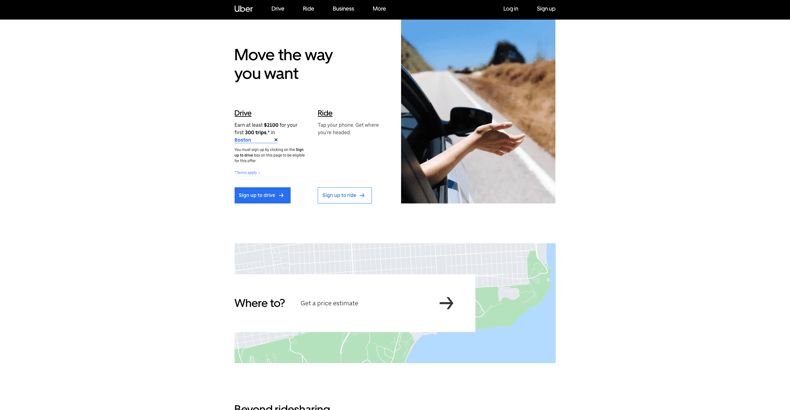
Uber shines a different light on its homepage. With a simple user experience as well, there is more text and links to click for information. In addition to highlighting their sign up for driving or sign up as a rider option, they also have a price estimator on their homepage. That allows those interested in using Uber’s service to first calculate the average cost of their ride so that they are prepared. They also showcase their other services such as Uber for business, dockless bikes, Uber Eats, Uber Freight, and Uber Air -- all services that Lyft doesn’t offer.
While both services are great, as far as brand websites go, Lyft positions their business as the industry leader. Their video speaks to visitors, and their simple user experience makes it easy for anyone to navigate to the answers they need about joining the company as a customer, employer, or just finding general information about Lyft.

Head to Head: SEO Tools
SEMrush and Moz are two of the most popular SEO tools and resource hubs. Both brands offer valuable software tools for digital marketers to take their SEO to the next level, and both offer wonderful resources for SEO professionals of all levels.
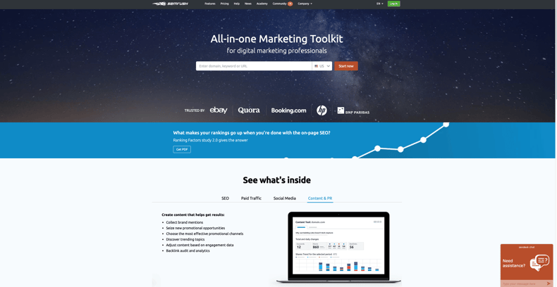
SEMrush pulls site visitors in to get started, right when they head to their website. An ungated option allows visitors to enter their domain, URL, or a keyword that they want to analyze. As users scroll down the homepage, they can also get a snapshot overview of what SEMrush offers for SEO, paid traffic, social media, and content & PR. Even further down the page are stats and customer testimonials, which builds brand trust on multiple levels.
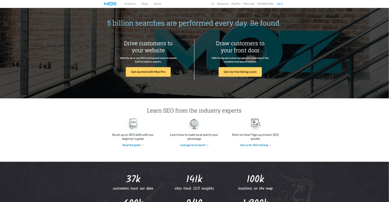
Moz leads with strong messaging about how many site searches happen per day (five BILLION!). They also show off their training capabilities so that even SEO beginners can learn from industry experts through multiple channels including a guide or an SEO training program. Moz also lists stats on their page about their number of customers, insights, and customer satisfaction.
Overall, both of these websites are simple, beneficial to customers, and easy to navigate. A tough decision, but in this head-to-head matchup, SEMrush positions themselves as the superior company. They include an overview with screenshots and bullet points for their different types of tools, which offers a lot of value to someone exploring and comparing SEO software tools.
Head to Head: Project Management Tools
If you’re like me, you need to have many to-do lists, spreadsheets, and plans. Apps like AirTable and Trello make my life much easier and much more organized through their platforms. Plus, their platforms make it easy for entire teams to collaborate, which is extremely helpful no matter the size of your team. The funny thing with these two sites is that their homepages are extremely similar, which means attention to detail is key when differentiating themselves.
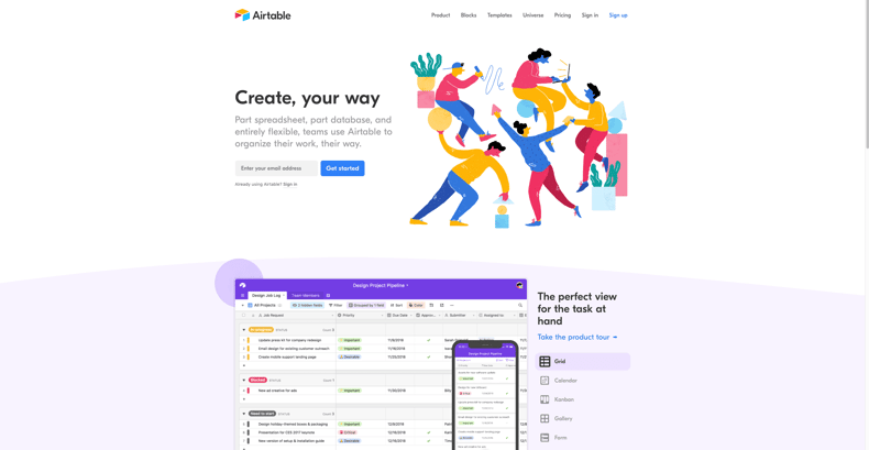
AirTable is a platform that includes a mix of a calendar, to-do list, spreadsheet, scrum -- all rolled into one. Their homepage is colorful, drawing the visitors’ eyes to key pieces such as benefits for each type of team, taking a product tour, and free sign up. Even without taking the full product tour, visitors can still see the different types of projects possible through their platform. Throughout their website, they use the same types of drawings and illustrations, which are unique to their brand.
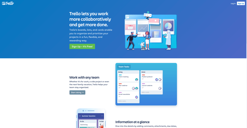
Trello also uses unique brand illustrations for their website, which adds a personal touch to their homepage. While AirTable uses a lot of colors on its homepage, Trello tends to stick to blue as the main color and uses complementary colors throughout the graphics. They also don’t draw attention to their CTAs other than their main CTA to sign up, which is green.
It’s hard to choose an industry leader from this pair of rivals. However, AirTable does an excellent job showing off its products’ capabilities and its brand. With colors drawing your eyes to different key areas, and a strong overview of what’s inside the product, their homepage differentiates them from their competitor, positioning them as a more robust option than Trello.
Head to Head: Grocery Delivery Services
More and more consumers are opting to have their groceries shopped by someone else and delivered to their homes. Since this is a relatively new industry, these brands are highly competitive, so their websites need to showcase them as the service to choose.
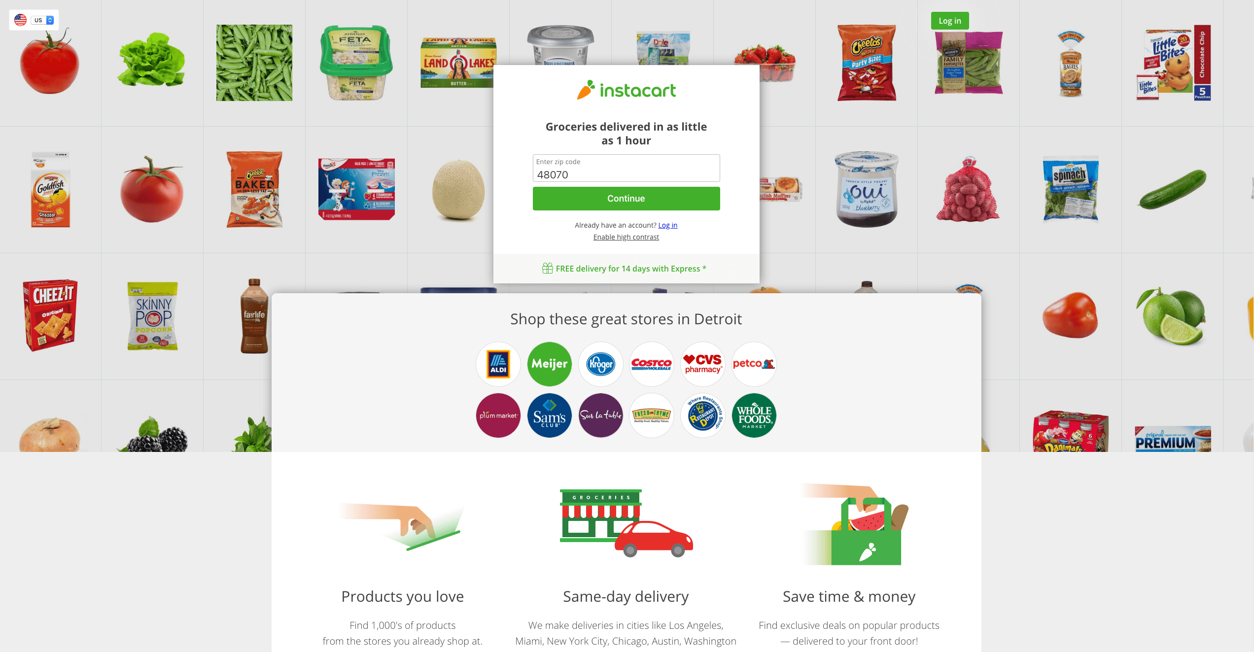
Instacart highlights the efficiency of their service first, telling visitors that they can get groceries delivered in as little as one hour, then it allows people to enter their zip code to see which stores are in their area. Their homepage highlights the seamless process of searching for products, easy delivery, and saving money and time. One key differentiator that Instacart has is that they offer deals on products with their exclusive coupons.
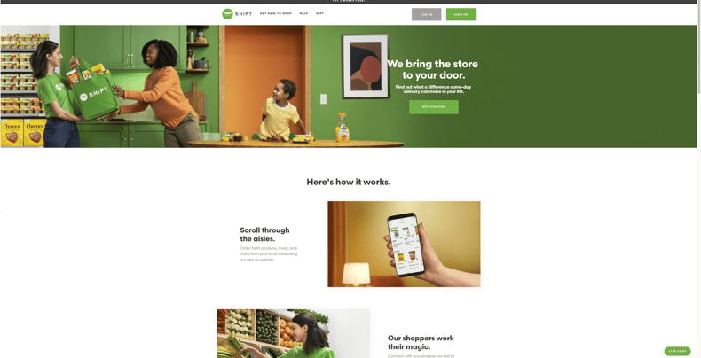
Shipt has organized its homepage to be like a story rather than a standard sales pitch. It starts with a statement of bringing the store to your door, with an accompanying image. Then as you scroll down, it shows you how the whole process works from your phone to the shopper in the store to delivery. Also, they show testimonials from both customers and shoppers, so you can get a full understanding of the process and the service. This allows site visitors to see the process from start to end, and most importantly, it speaks directly to the visitor's pain points.
Interestingly enough, both of these brands use green as the main color in their color palette. In addition, both websites put a focus on ease of use and quality of products. However, Shipt does a great job at positioning themselves as industry leaders because its site is simple, clean, tells a story, and highlights testimonials from both customers and shoppers.
Differentiating yourself from your competition is critical when you’re in a highly saturated market. It’s important to remember that while your product needs to be superior, your brand presence and company website are also great tools for standing out in your market and gaining a competitive advantage over your competition.

Related Blog Posts
Popular Posts
-
 Sales Battlecards 101: How to Help Your Sellers Leave the Competition In the Dust
-
 How to Create a Competitive Matrix (Step-by-Step Guide With Examples + Free Templates)
-
 The 8 Free Market Research Tools and Resources You Need to Know
-
 6 Competitive Advantage Examples From the Real World
-
 6 Exceptional Brand Messaging Examples We Can All Learn From

